 Make.com
 BigQuery
 Google Sheets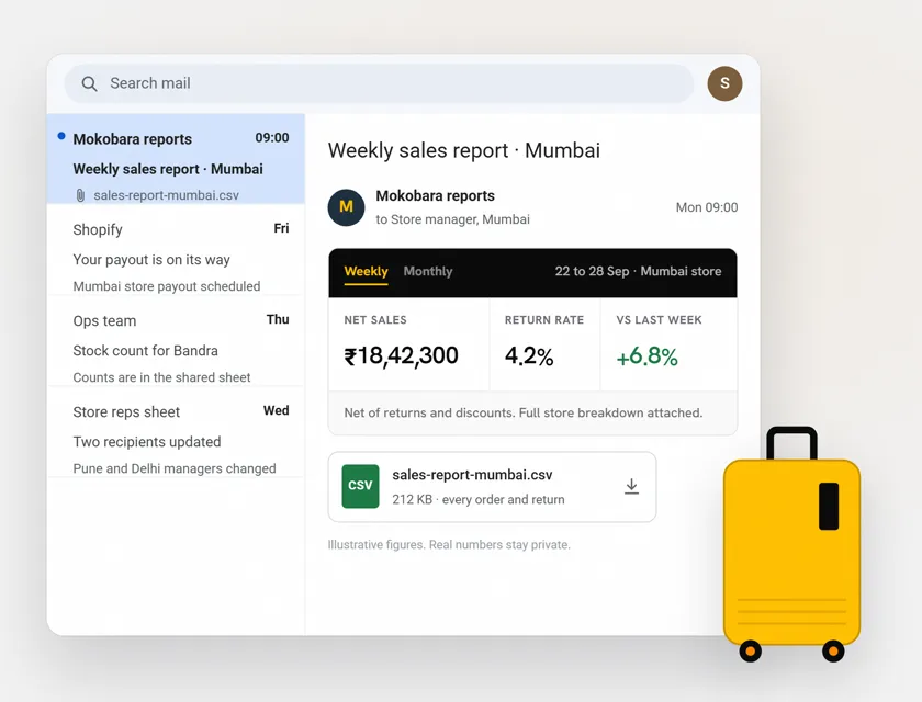
The Situation
Mokobara is a premium DTC travel brand selling luggage, backpacks and accessories through multiple Shopify storefronts. Their operations team needed consolidated sales reporting across all stores, but every data source lived in a different system: Shopify admin panels for orders, BigQuery for historical warehouse data and Google Sheets maintained by different team members.
The core challenge was volume. Each reporting cycle required pulling 100,000 to 250,000 sales records from BigQuery across all stores. BigQuery cannot return this volume in a single API call. The data had to be fetched in paginated batches, combined inside Make.com, then processed into meaningful KPIs.
Getting a single answer to "what were net sales across all stores this week" required a person to manually pull numbers from each store, cross-reference returns and shipping data, reconcile discrepancies and compile a report. This process took 1 to 2 days every cycle and the numbers were never fully trusted because manual compilation introduces errors.
The outcome: the team went from waiting days for a hand-built report to a weekly and a monthly report in every store manager's inbox, on schedule.
The 3 Problems
- Massive data volume could not be pulled in one shot. 100K to 250K records across all stores required paginated BigQuery queries. No off-the-shelf reporting tool handled this without custom engineering.
- Manual report compilation took days. Someone spent 8+ hours every cycle pulling, reconciling and formatting sales data from multiple sources. By the time the report was ready, the numbers were already stale.
- No automated distribution. Even after the report was compiled, it had to be manually emailed to different store representatives and managers. Each recipient needed different data slices relevant to their store or region.
What Was Built
A scheduled sales intelligence pipeline that pulls high-volume data from BigQuery in paginated batches, calculates KPIs inside Make.com, generates formatted reports and distributes them automatically to the right people.
How it flows:
- Make.com scenario triggers on a weekly or monthly schedule
- BigQuery module runs paginated queries, pulling 100K to 250K records in batches
- Make.com combines all paginated results into a single dataset
- KPI calculation modules process the combined data: net sales per store, revenue totals, return rates, growth comparisons
- A CSV file is generated with sales totals and detailed calculations per store
- An HTML email is built with a formatted summary of key KPIs based on the store-level sales data
- Recipient list is pulled from a Google Sheet containing store representatives and managers with their email addresses
- Each recipient receives their email with the KPI summary and CSV attachment
Tools used:
- Make.com - scheduled triggers, paginated BigQuery queries, data aggregation, KPI calculation, CSV generation, HTML email composition, distribution
- BigQuery - data warehouse holding 100K to 250K sales records across all stores
- Shopify - order source data feeding into BigQuery
- Google Sheets - recipient directory (store reps and managers with email addresses)
- Email - formatted HTML reports with CSV attachments
The Technical Architecture
The hardest part of this build was not reporting. It was handling the data volume inside Make.com.
Paginated BigQuery pulls: BigQuery returns large datasets in pages. The Make.com scenario runs a loop: query page 1, store results, query page 2, store results, continue until all pages are retrieved. For 250K records, this can mean 25+ paginated calls per run. Each page is appended to an array aggregator that holds the complete dataset in memory before processing begins.
KPI calculation inside Make.com: Once all records are combined, Make.com calculates the metrics that matter: net sales per store (gross minus returns minus discounts), revenue growth vs previous period, return rates by store and product category, top-performing SKUs and underperforming segments. These calculations happen using Make.com's math and aggregation modules, not in BigQuery, because the business logic for what constitutes a "net sale" differs from what BigQuery stores as raw transaction data.
CSV generation: The calculated KPIs are formatted into a downloadable CSV with store-level breakdowns, period comparisons and summary rows. This CSV is attached to the email so recipients can do their own analysis in Excel if needed.
HTML email with KPI summary: Rather than sending a raw data dump, the email contains a formatted HTML table with the headline numbers: total net revenue, store-by-store breakdown, period-over-period change and any flags (e.g. a store with return rate above threshold). The email is designed to be read in 60 seconds and give each recipient the numbers relevant to their responsibility.
Smart distribution from Google Sheet: The recipient list lives in a Google Sheet with columns for name, email, role and store assignment. The scenario iterates through this sheet and sends each person their report. Managers get the full cross-store view. Store representatives get their store-specific slice. This means one scenario run produces personalized reports for every stakeholder.
The Results
| Metric | Before | After | Change |
|---|---|---|---|
| Time to compile sales report | 1-2 days | Automated (scheduled) | Eliminated |
| Records processed per cycle | Manual sampling | 100K-250K (full dataset) | Complete coverage |
| Manual data reconciliation | 8+ hours/cycle | 0 hours | Eliminated |
| Report distribution | Manual email per person | Automated per role | Personalized delivery |
| Data freshness | Days old by delivery | Current as of run time | Always fresh |
The Insight
The lesson from this build is that automation at scale is an engineering problem, not a configuration problem. Connecting BigQuery to email is trivial. Handling 250K records across paginated API calls, calculating derived KPIs in-memory and generating personalized reports per recipient requires careful architecture.
The other insight: reporting is not a dashboard problem for every team. Mokobara's leadership did not want to open a dashboard every morning. They wanted the numbers delivered to their inbox in a format they could scan in 60 seconds. The right output format depends on how the recipient actually consumes information, not on what looks impressive in a demo.
What Could Be Added
This system currently delivers scheduled email reports. Two natural extensions that would add more value:
Slack agent integration: A Slack bot that the team can query on demand. Instead of waiting for the weekly report, a manager types "/sales last 7 days Store Mumbai" and gets an instant answer pulled from the same BigQuery data. This adds real-time access without replacing the scheduled reports.
Live dashboard: An Airtable or Retool dashboard showing real-time sales data with filters by store, date range and product category. Useful for the operations team that needs to drill into details beyond what the email summary provides.
Both are natural add-ons that build on the existing data pipeline without requiring a rebuild.
FAQ
Q: Can Make.com handle 100K+ records from BigQuery? A: Yes, with paginated queries. BigQuery returns large datasets in pages. Make.com runs a loop that fetches each page, aggregates all results and processes the complete dataset. For 250K records, this typically means 25+ paginated API calls per scenario run.
Q: How does Make.com calculate KPIs from raw sales data? A: Make.com's math and aggregation modules handle the calculations: net revenue (gross minus returns minus discounts), period-over-period growth, return rates by store and category. The business logic for these calculations is configured in the scenario, not in BigQuery, because definitions of "net sale" often differ from raw transaction data.
Q: Can automated sales reports be personalized per recipient? A: Yes. The recipient list in Google Sheets includes role and store assignment. The scenario sends managers the full cross-store view and store representatives their store-specific data. One run produces personalized reports for every stakeholder.
Q: What format are the automated sales reports delivered in? A: Two formats per email: an HTML summary with headline KPIs formatted for a 60-second read, plus a CSV attachment with full store-level breakdowns for anyone who wants to analyze further in Excel.
Need automated reporting for a multi-store or multi-source operation? Book a free consult and I will scope what your data pipeline needs.